
Best Website Color Schemes and Trends to Enhance Your Website’s Appeal
Published By: Shubham Ahuja Published On: 14 Aug 23 7 Min Read
Did you guys know that compared to other visual components on business websites, good website color schemes draw about two-fifths of customers (39%) the most?
A captivating website is crucial for any business or creative endeavor in today’s digital age. One of the key elements that can significantly impact a website’s appeal is its color scheme.
Colors profoundly affect human emotions and perceptions, influencing how visitors engage with your website, interpret its content, and form lasting impressions.
This blog will jump deeply into the fascinating world of trending color palettes for websites and explore the trendiest, most popular website color schemes palette generators that will captivate your visitors.
As a leading website design company, we believe in the transformative impact of the perfect color scheme. Our expert team of designers stays up-to-date with the latest color trends as well as comprehends the psychology behind each hue.
We at Believ-In Technologies know how to harness the potential of colors to create websites that truly resonate with your target audience, leaving them spellbound.
Without any further ado, let’s get started!
Table of contents
- What is the Website Color Rule?
- Why Use Website Color Schemes?
-
What is the Best Color Palette For Website Design?
- Culturally Connected
- Gritz
- Accomplice
- Dom Jacob
- Bateau Mon Paris
- Spotify
- Wistia
-
What Color is Attractive For Website Design?
- White and Blue
- Yellow Green and Dark Grey
- Red and Black
- Pink
- White
- Wrapping It Up
What is the Website Color Rule?

The website color rule is a simple guideline that suggests using a limited number of colors on your website. By selecting a primary color (60%) and a few complementary shades (30%) and (10%), this rule enhances readability, brand identity, and overall aesthetics, resulting in a more engaging online experience.
By sticking to a cohesive color palette, you create a harmonious and visually appealing design. This 60%, 30% and 10% rule helps avoid overwhelming visitors with too many colors and ensures a balanced and professional look for your website.
However, do not forget that the use of color in web design requires a careful balancing act between form and function. By taking your time and experimenting with various web color schemes, you can find the ideal color scheme for your website.
Furthermore, this process will allow you to discover the perfect blend of colors that resonates with your audience as well as enhances their overall browsing experience.
Why Use Website Color Schemes?
Are you ever curious about why a color palette is used on a website that goes beyond simple fanciful?
Let’s take a closer look at this interesting topic!
Imagine that your visitors might experience an instant connection with you thanks to modern color combinations for websites and palettes. It’s like using feelings as well as energy to paint your website.
However, there’s still more. Color can enhance your website’s user experience. It resembles a blank canvas on which your stuff will shine.
Your website could be made aesthetically appealing and harmonious by selecting the best website color schemes for website design and the finest website color schemes. Your brand’s identity is elevated, and customers are left with a lasting impression by effective color selections for websites.
The secret ingredient that updates the appearance and feel of your website is its color palette. They seamlessly lead viewers through your content!
As a result, embrace the magic of good color combinations for websites, and watch your site come to life with vibrant appeal.
What is the Best Color Palette For Website Design?
So, now that we have gone through the website color rules and why you should use web design color schemes, let us find out what are the best trending color palette for website used by companies.
1. Culturally Connected
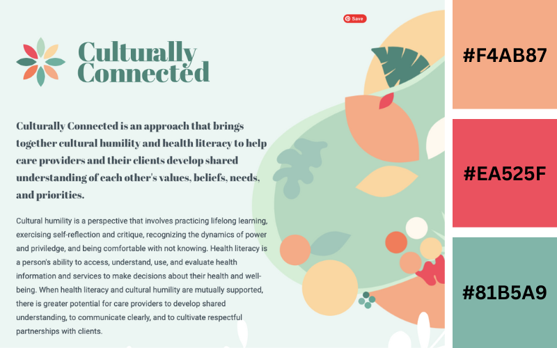
- Tan Hide
- Vermilion
- Acapulco
Tan Hide and Vermilion are beautiful sunset-like colors. They can be a little overwhelming, so consider cooling them off with a soothing color like the pale green of Acapulco.
2. Gritz
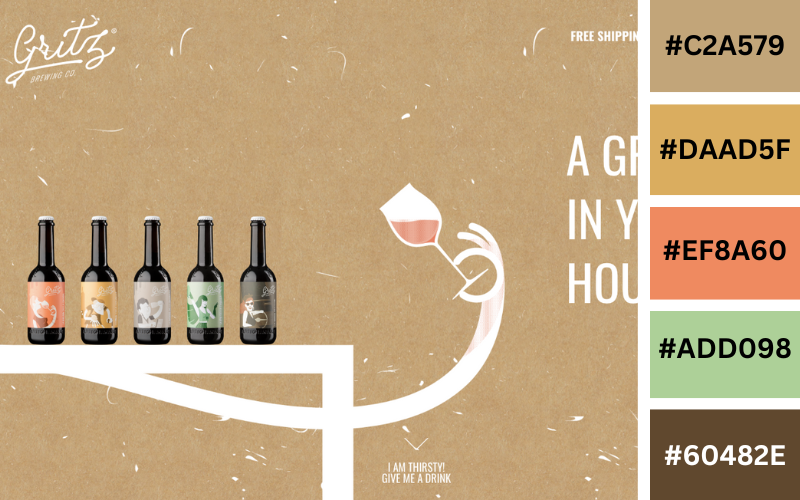
- Spice
- Tuscany
- Jaffa
- Calico
- Yellow Metal
Embrace the strong reds of Spice and Tuscany and the dusky yellows of Jaffa and Yellow Metal. They provide a hot, spicy feel to any design. With Calico, you can have a bright contrast without resorting to white.
3. Accomplice
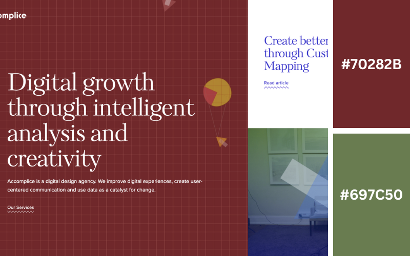
- Coral Red
- Viking
This color scheme uses a subtle pale blue (Viking) that provides a soothing breath of fresh air to any site. Adding splashes of coral red provides a shock of contrast without overdoing it on saturation. It gives a cool oceanic vibe broken up by the splashes of coral.
4. Dom Jacob
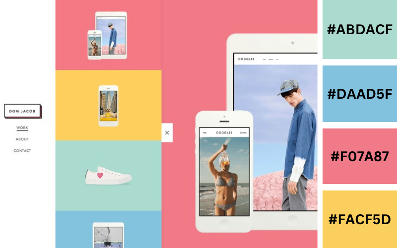
- Persian Green
- Vista Blue
- Mauvelous
- Sunflower
This color scheme accosts the monitor or page with dramatic color without being too harsh. The green, coral, and yellow are soft yet disarming.
5. Bateau Mon Paris
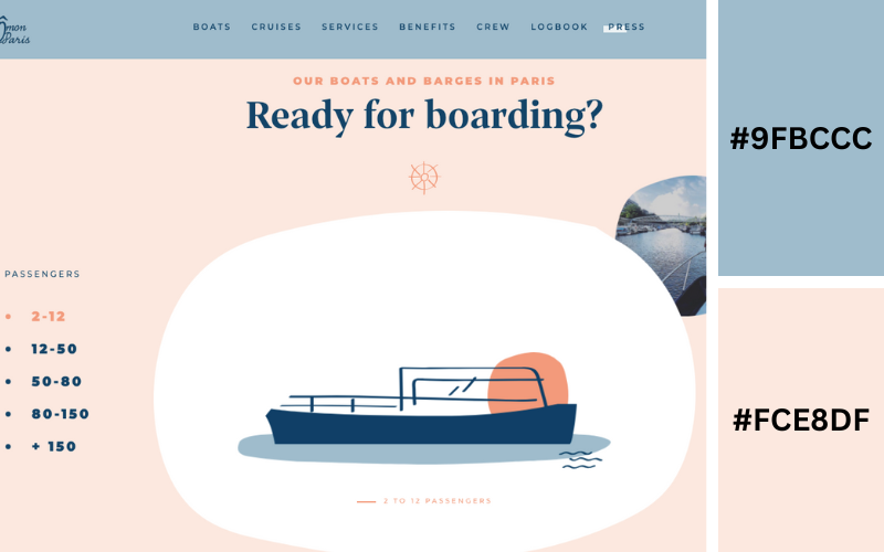
- Viking
- Karry
Viking provides a pale blue that, when paired with a soft creamsicle color like Karry, makes for a soothing feel in pastel complementary colors.
6. Spotify
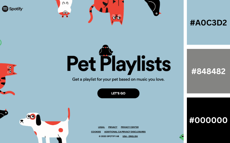
- Nepal
- Ship Gray
- Black
Ship Gray is a fantastic alternative to boring black text with their super dark contrast. This plays out well when paired with the pale blue-grays of Nepal.
7. Wistia
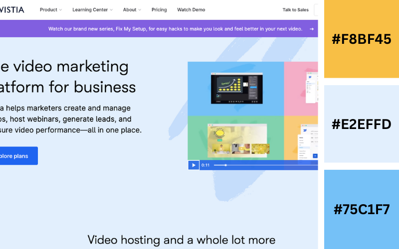
- Marigold Yellow
- Ice Cold
- Vista Blue
Marigold Yellow and Vista Blue are warmer colors that contrast nicely with the temperature difference of the Ice Cold blue despite being an analogous color scheme. The result is subtle but fun color shifts.
What Color is Attractive For Website Design?
Pay attention if you wish to attract people to your website.
Everyone wants to know: What color makes a good website design?
There isn’t an all-purpose solution, but we will reveal some design tricks to assist you in choosing the ideal color scheme.
So, buckle up let’s dive into the world of colors:
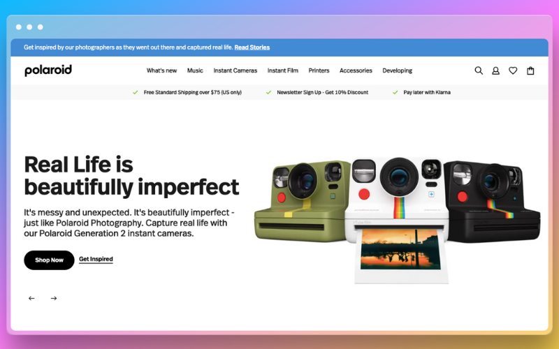
White and Blue

White, symbolizing purity and simplicity, provides a clean canvas for web content, allowing it to shine without distractions. Blue, on the other hand, embodies trust, professionalism, and a sense of security.
When used intelligently in website design, this combination can convey a sense of reliability while evoking a serene ambiance.
A prime example of harnessing the potential of white and blue is the website of Believ-In Technologies. Specializing in website development and design services, the choice of this color scheme is deliberate. The crisp white background imparts a sense of modernity and openness, while varying shades of blue strategically guide the user’s attention to key elements such as navigation menus, call-to-action buttons, and important announcements.
This harmonious blend of white and blue not only showcases professionalism but also fosters a comfortable browsing experience.
Yellow Green and Dark Grey
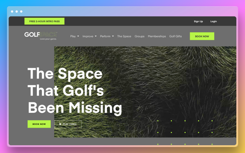
In a moderate website color scheme, bright colors draw attention to important information. GolfSpace is a prime example of a website that makes use of this bold-subdued color scheme.
The website of GolfSpace has a limited color scheme, mostly using deeper grey tones. The color is yellow-green or greenish and is used to draw attention to important details like buttons, pricing, and deals. Yellow-green stands out against the website’s grey background without any effort.
Using yellow-green makes CTAs easier for visitors to see, which improves conversions. Additionally, the hue inspires an energizing feeling, making it appropriate for a sports-related website.
Red and Black
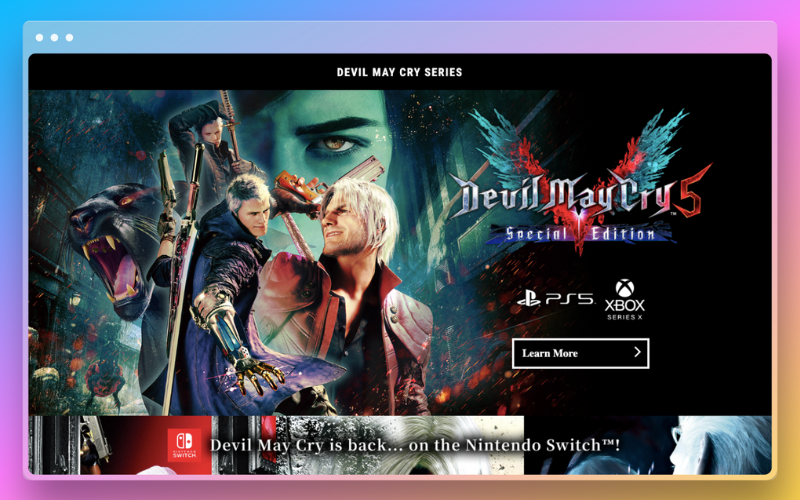
Imagine a website with a fiery red as well as a slick black color scheme that exudes sophistication and passion!
Bold red components, therefore, focus attention on the crucial information, such as buttons and headlines, and thrill visitors as they direct them. The elegant cold black backdrop, on the other hand, serves as a canvas on which the vivid red may shine.
Consider the website of a fashion boutique: the red conveys a desire for style, the black gives a touch of refinement, and each visitor is made to feel like a runway model.
Take advantage of this dynamic pair, and watch your website transform into a stunning work of art.
The popular gaming website Devil May Cry has this color palette.
Pink
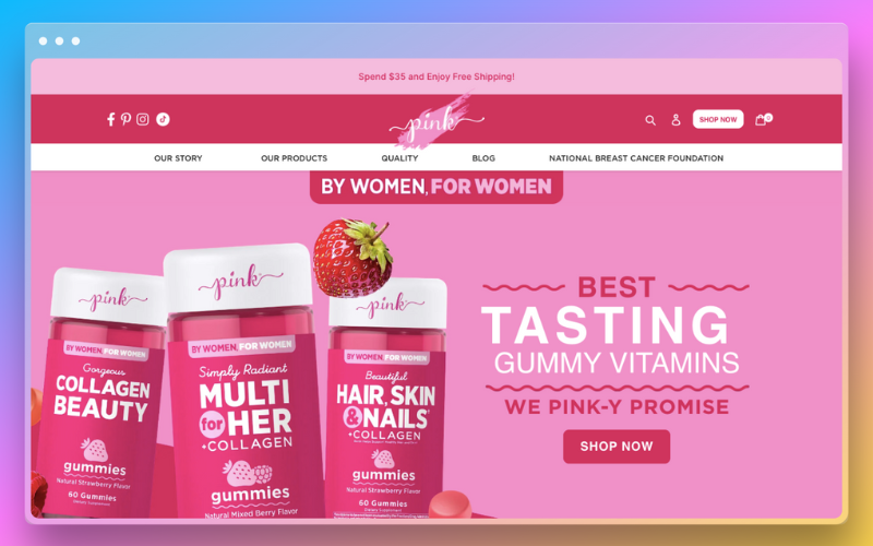
It is a symbol of imagination as well as vigor. It is having a great time right now because more than ever, people of all genders and identities are embracing it.
As a result, corporations are following suit as well as infusing pink into a variety of sectors.
For example, a website named Pink Products is an online store that sells vitamin gummies for women health. Soft pink hues that create a cozy and welcoming environment welcome you as soon as you land on the site.
White
White connotes simplicity as well as openness. Furthermore, sometimes using no color at all is the greatest option for simple web design.
Since white is a neutral color, it may be readily paired with various hues for branding purposes. Additionally, it is frequently used as the best background color for website.
A website that uses a white color scheme is “Medium.” Popular online publishing platform Medium is where authors and bloggers can reach a worldwide audience with their tales as well as writings.
Wrapping It Up
Believ-In Technologies offers web design services that web development trends create trends rather than merely following them. Our talented design team is unmatched in its understanding of the power of trendy color schemes.
We’ll build a visual symphony that catches hearts and turns visitors into devoted followers with the ideal fusion of modern website color schemes, trending palettes, and classic colors.
Leave color ambiguity behind as well as welcome a website that says words about your business. We can help you achieve either a sleek and refined appearance or a lively and upbeat atmosphere. Your website’s popularity will fly to new heights with Believ-In Technologies, leaving your rivals in the dust!
If you can have amazing, why settle for ordinary?
Together, let’s take on this creative journey and see your website glisten like a light in the online world.